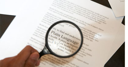
 If done well, written materials can be an incredibly useful tool to help patients and clients manage their own health. But few are. Worse, illness and injury can reduce literacy levels, putting critical information out of reach. Say Ah!’s tips can help you evaluate your existing materials, and also help you create easy-to-read and easy-to-use new ones.
Evaluating Existing Materials
Creating New Materials
Writing for Your Readers
Design for (Almost) All
Evaluating Existing Materials: The best way to see if the materials you are handing out are helpful is to ask your patients and clients to tell you what they honestly think. If that’s not your style, you can use the following tips to spot-check handouts and websites. Make sure:
- The material is appropriate for the audience. (For example, give adolescents pamphlets featuring teens not young children)
- The type is readable (if you can squint and still tell a “c” from an “e” it probably is), and not laid over a picture or other graphic
- The text is written at a 6th grade reading level (about the same as a gossip magazine. We don’t support gossip, but we do support clear writing!)
- All medical terms and seemingly common phrases are defined for the reader (even “heart attack”)
- It passes the “I’m busy” test: Read it quickly, and with distractions (hey, that’s real life). Can you still get the meaning with the TV blaring? If so, it is most likely accessible
Creating New Materials: A good, simple handout can be a truly effective learning tool for your patients and clients. Here are some general tips on how to create your own materials (for specifics on writing and design see below):
- Define the objective, and stick to it! Know what you want the piece to do, whether it is to teach someone to dress a wound or perform a breast self-exam or to get them to be screened for high blood pressure. Every word and picture should be in the service of this goal
- Keep it simple by only giving patients/clients the information they need. Too much information can be overwhelming and can dilute key messages. It will take a few edits to narrow the information down, so keep asking yourself “is this necessary?”
- Show your audience themselves. People are going to relate better to pictures and words that reflect people of the same age, race, culture, etc
Write for Your Readers: The key to getting your message across is to write for your reader not yourself. It sounds simple enough, but most of us have difficulty thinking the way others think. As best you can, put yourself in your patients’/clients’ shoes. Also:
- Prioritize information so the most important messages are first, and limit content to 3-5 key concepts
- Use an active voice and be positive (Example: “Walking is a great way to exercise.”)
- Keep words and sentences short
- Use plain language and define any and all medical jargon, even seemingly common terms like heart attack or menopause or nurse practitioner
- Be very specific, especially concerning important directions such as “Do not take with food, or within 3 hours of eating” or “take with a full glass of water”
Designing for (Almost) All: Content is king but only if your patient/client can actually read and understand the text on the page (or screen). Here are some basic accessible design principles to use the next time you are creating written materials such as educational hand-outs, forms, etc., or any signage in your office or facility. Accessible materials ensure that:
- The overall look is clean, uncluttered, with plenty of open space
- The text is left justified, the type size at least 12 points; avoid underlining, all-caps, hyphenation and italics
- Key concepts are highlighted and pictures should be used to support important information
- Keep contrast high enough that text and background are distinct, but low enough that glare is not a problem
Say Ah! can help you learn more ways to create accessible and effective written (or digital) materials, or do the creating for you! Click here to learn more.
